Logos for each show
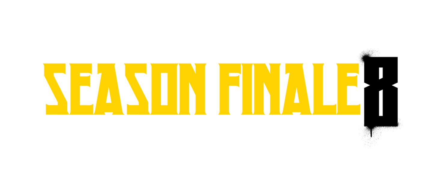
A unique typographic title was created for each show, serving as a key element of the artwork that links the imagery to the event’s theme.


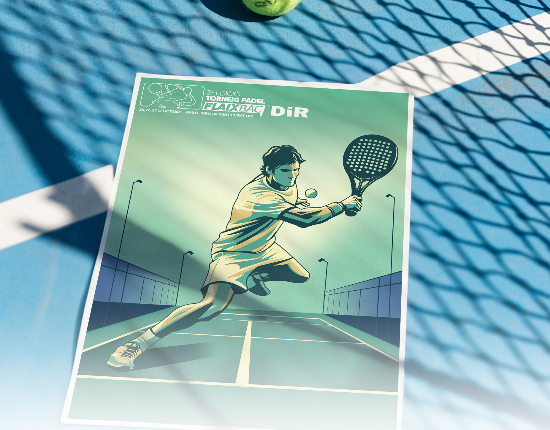
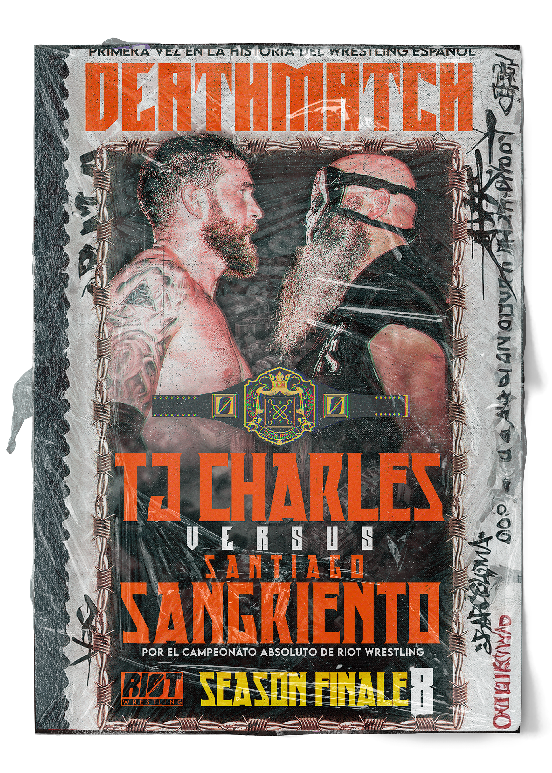
Posters
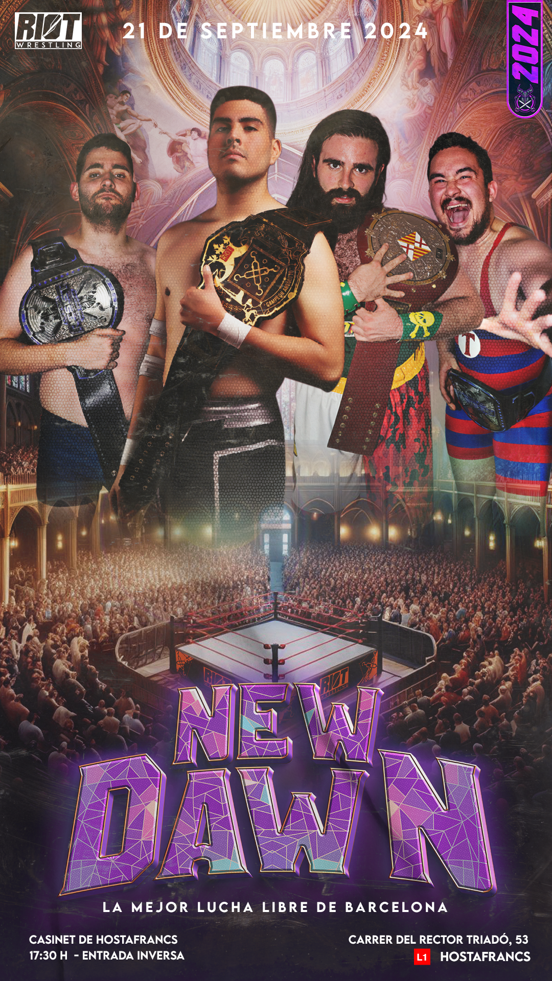
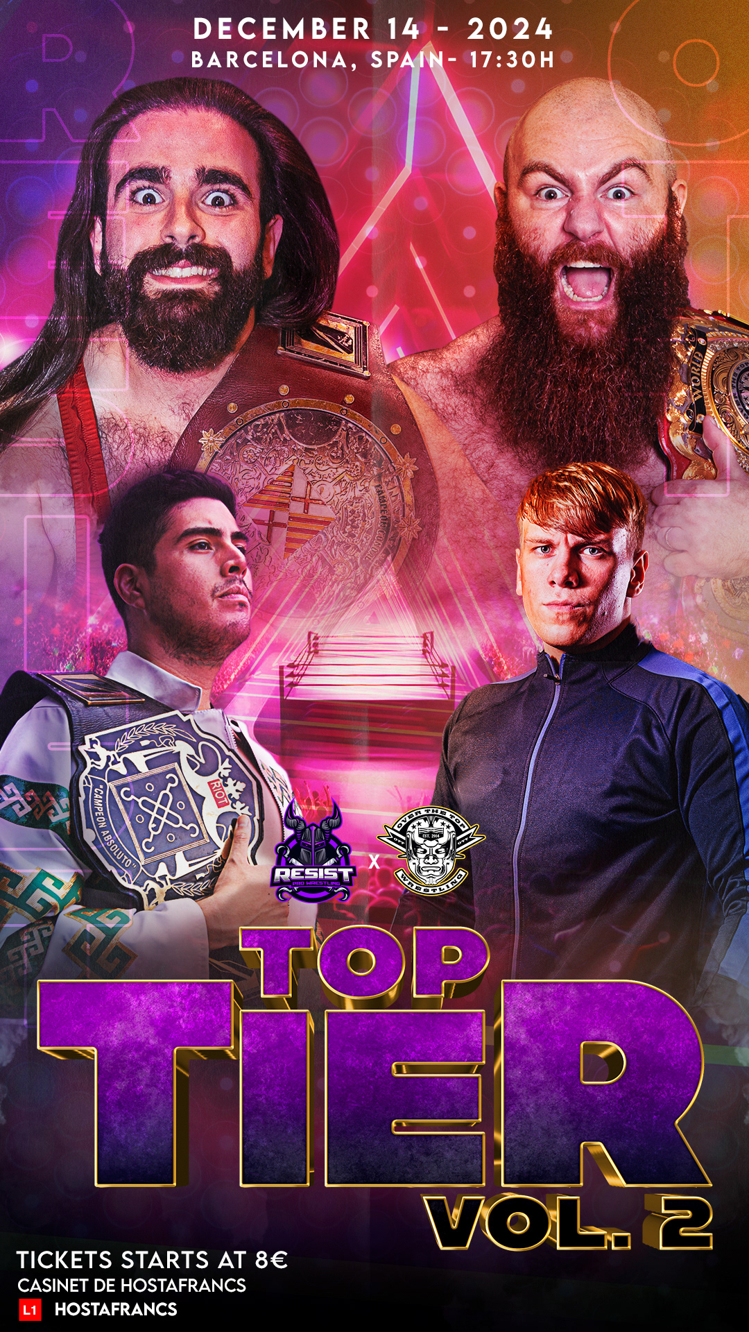
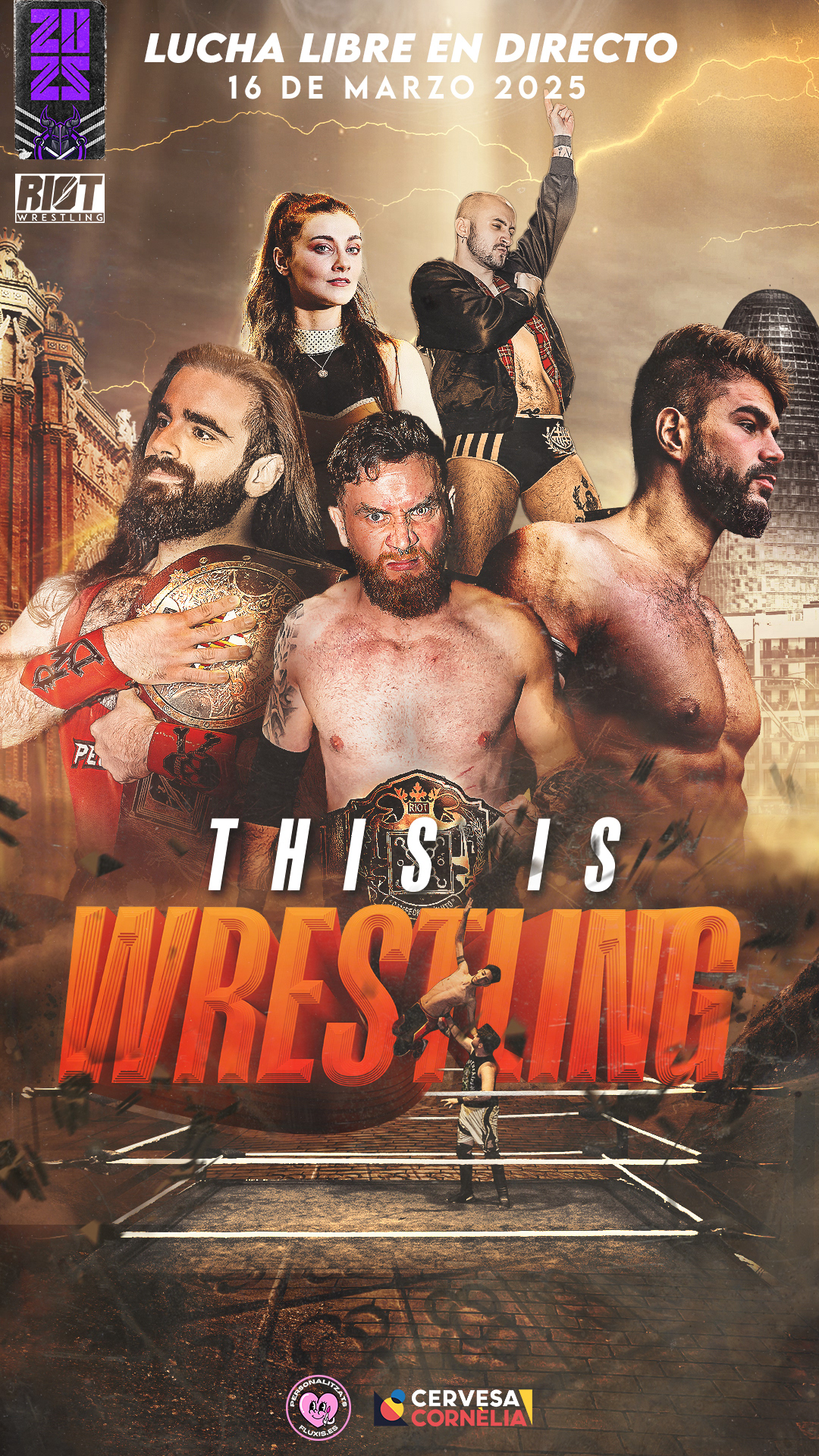
Each poster was designed with a distinct visual concept, tailored to reflect the unique theme of its respective show. From the choice of color palette and imagery to the composition and typography, every element was carefully crafted to evoke the mood, narrative, or inspiration behind each event. This approach ensured that no two posters felt the same each became a visual extension of the show’s identity, offering audiences a preview of the atmosphere and story they could expect.


Animated posters
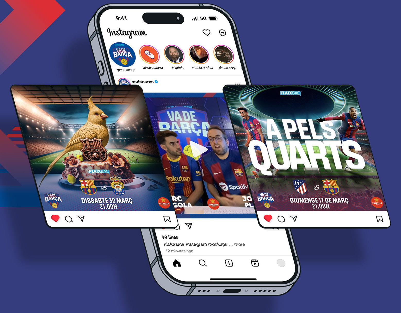
The animated versions of the posters played a key role in boosting engagement across social media platforms. By bringing the artwork to life through motion, each animation captured attention more effectively in crowded feeds, increasing shares, comments, and overall visibility. This dynamic approach not only amplified the impact of the original designs but also set the promotion apart from other wrestling brands in Europe, most of which still rely on static visuals.
The result was a stronger digital presence and a more memorable brand identity in an increasingly competitive market.
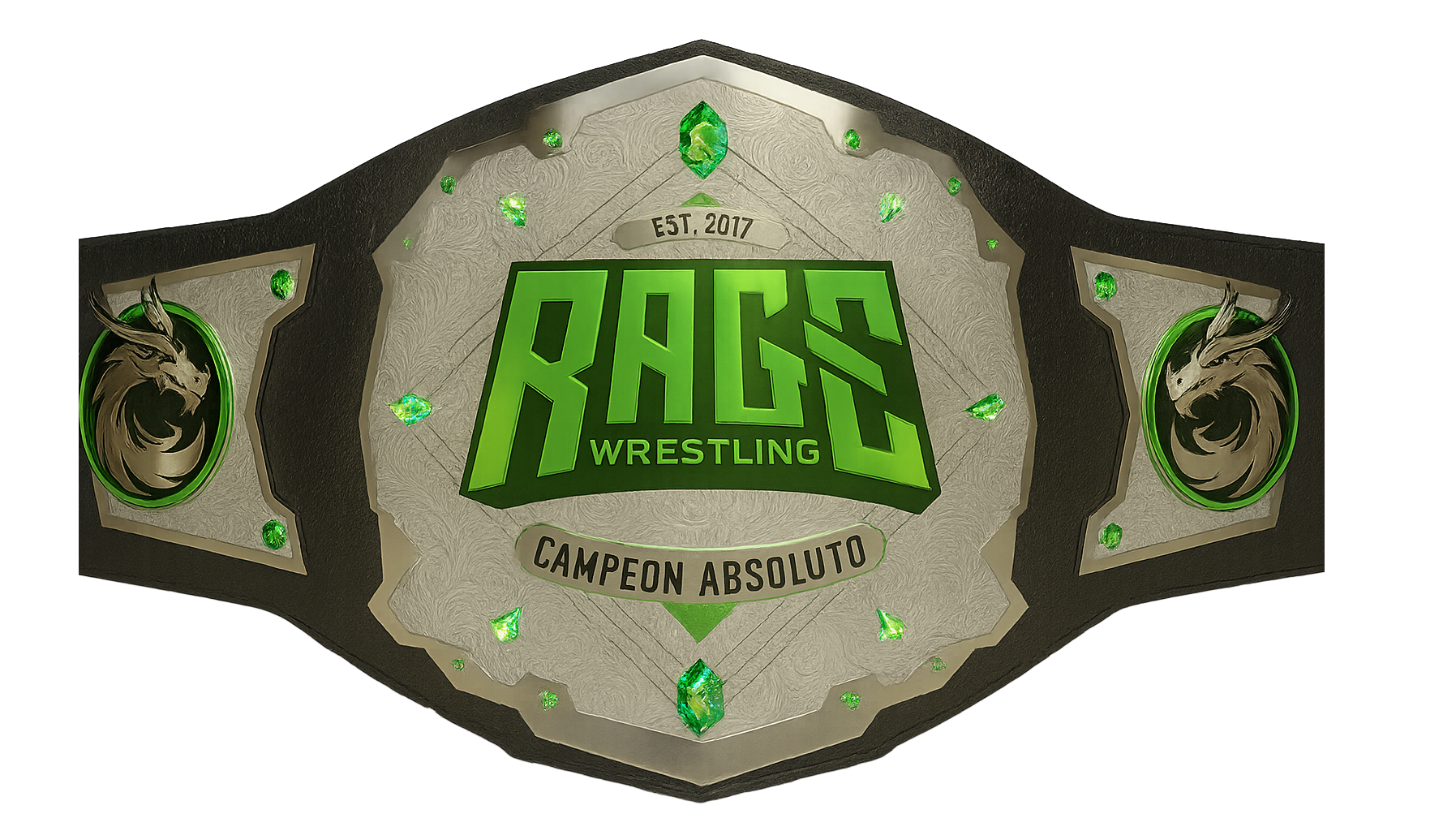
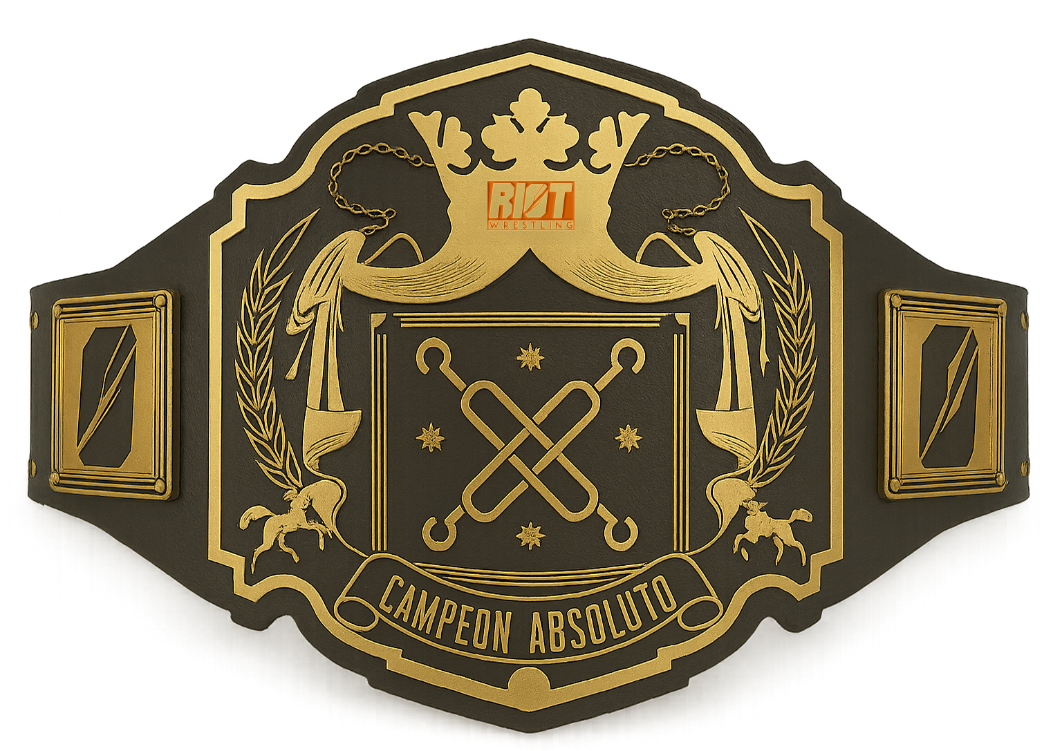
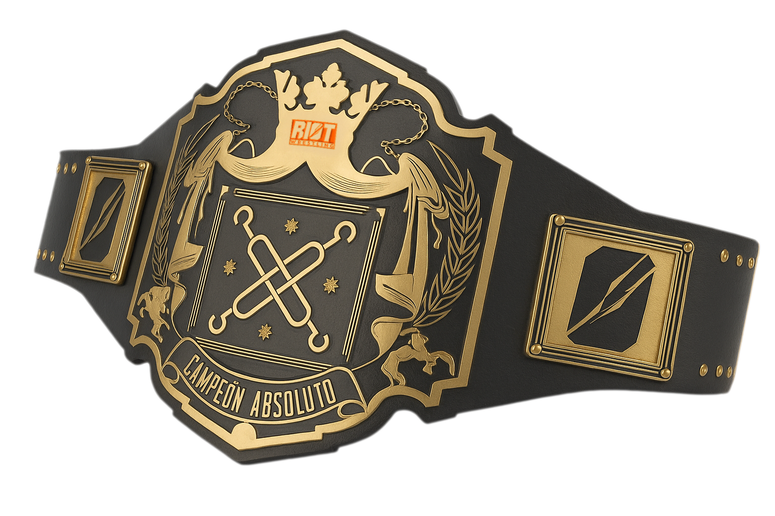
The use of AI and 3D Renders
AI was used to generate 3D versions of the championship titles, allowing for greater visual versatility across different graphic materials. These high-quality renders made it possible to integrate the belts seamlessly into promotional assets, posters, animations, and social media content, without the need for physical photoshoots or complex 3D modeling. The result was a consistent, dynamic representation of the titles that enhanced the brand’s visual identity while streamlining the creative process.